Tech By Choice is a non-profit organization that hosts events and workshops to help people from
marginalized communities find their place within the tech industry.
My Role
• Information Architecture
• User Research
• UX Design
Timeline
April 2020 - March 2021
Timeline
Oct – Nov 2018
Tools
• Figma
• Optimal Workshop
Tech By Choice needed to redesign their website to fit the needs of their growing organization and to support fundraising efforts. I was part of a small team who worked from the ground up to design a roadmap for the future of the organization, branding, and their new website.
Information Architecture
Structuring a new website for the community, by the community
Running an Open Card Sort
The first step in designing the overall information architecture and eventually the navigation of Tech By Choice (TBC) was to run a card sorting study with community members. Because we were designing from the ground up, I decided to use a generative approach and go with an open card sort, where users are able to place cards into categories that they name themselves. This way we’d be able to find out how members conceptualize our content and where they expect to find information. This would also help generate ideas on how to structure and label content on the site.
Card Sort Results
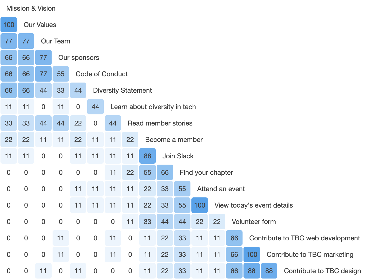
The similarity matrix displays card contents along with the percentage of participants that paired corresponding cards together.
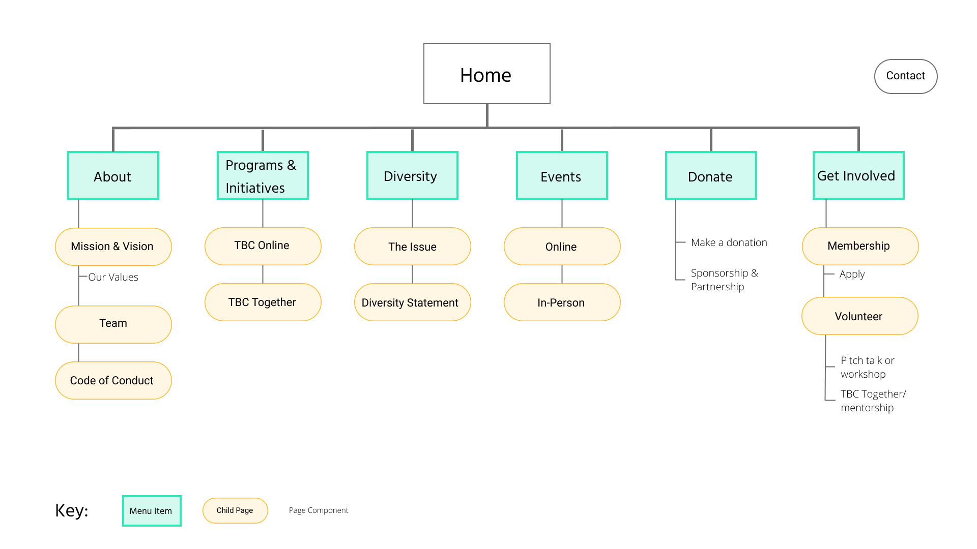
An Early Sitemap
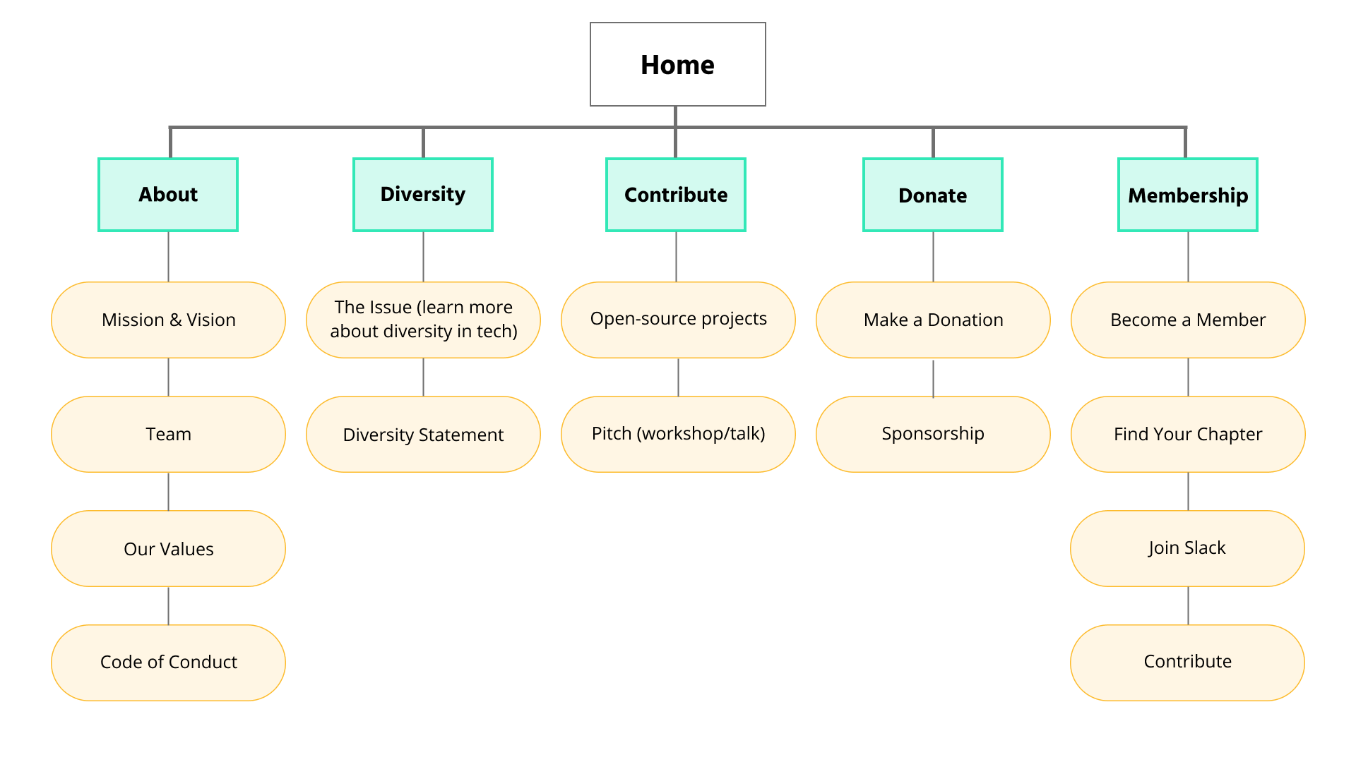
An early sitemap based on the card sorting results.
Testing the Sitemap with Users
Evaluating the sitemap with tree testing
After reviewing the sitemap I put together based on card sorting results, the team discussed possible iterations based on goals and priorities for the organization. Once we had a revised sitemap that we agreed on, the next step was to test it with users. To evaluate if users are able to find the information they need in our proposed sitemap, I designed a tree test. The “tree” consists of a simple drop-down menu version of a sitemap. Users are given tasks and asked to navigate to where they’d expect to find the information they’d need to complete the task.
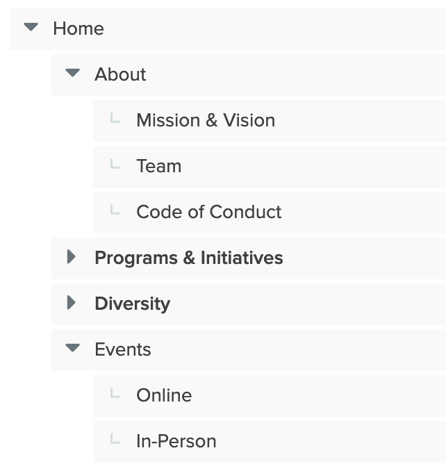
Part of the menu from the tree test
Tree Test Tasks
The TBC team chose tasks based on what we know members already come to us for, what potential members would need upon landing on our site, and leadership goals for the organization. Here are a few examples of the tasks we tested:
- You're interested in joining Tech By Choice, find out how.
- Your company wants to sponsor a non-profit, find out if you can sponsor Tech By Choice.
- You heard about a free webinar hosted by Tech By Choice and want to participate.
Tree Test Results
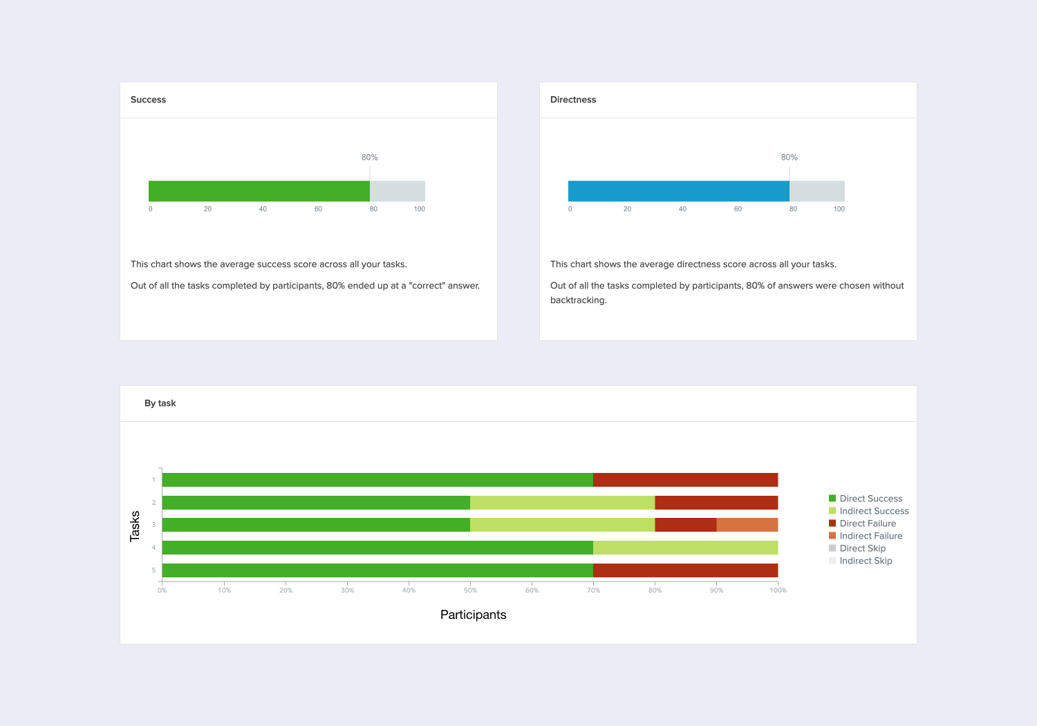
Our sitemap proved to be effective, with an 80% success rate across 5 tasks and 12 participants. Only a few minor edits were needed to streamline the site’s navigation design and make it clearer for users in the areas where there was friction.
UX Design
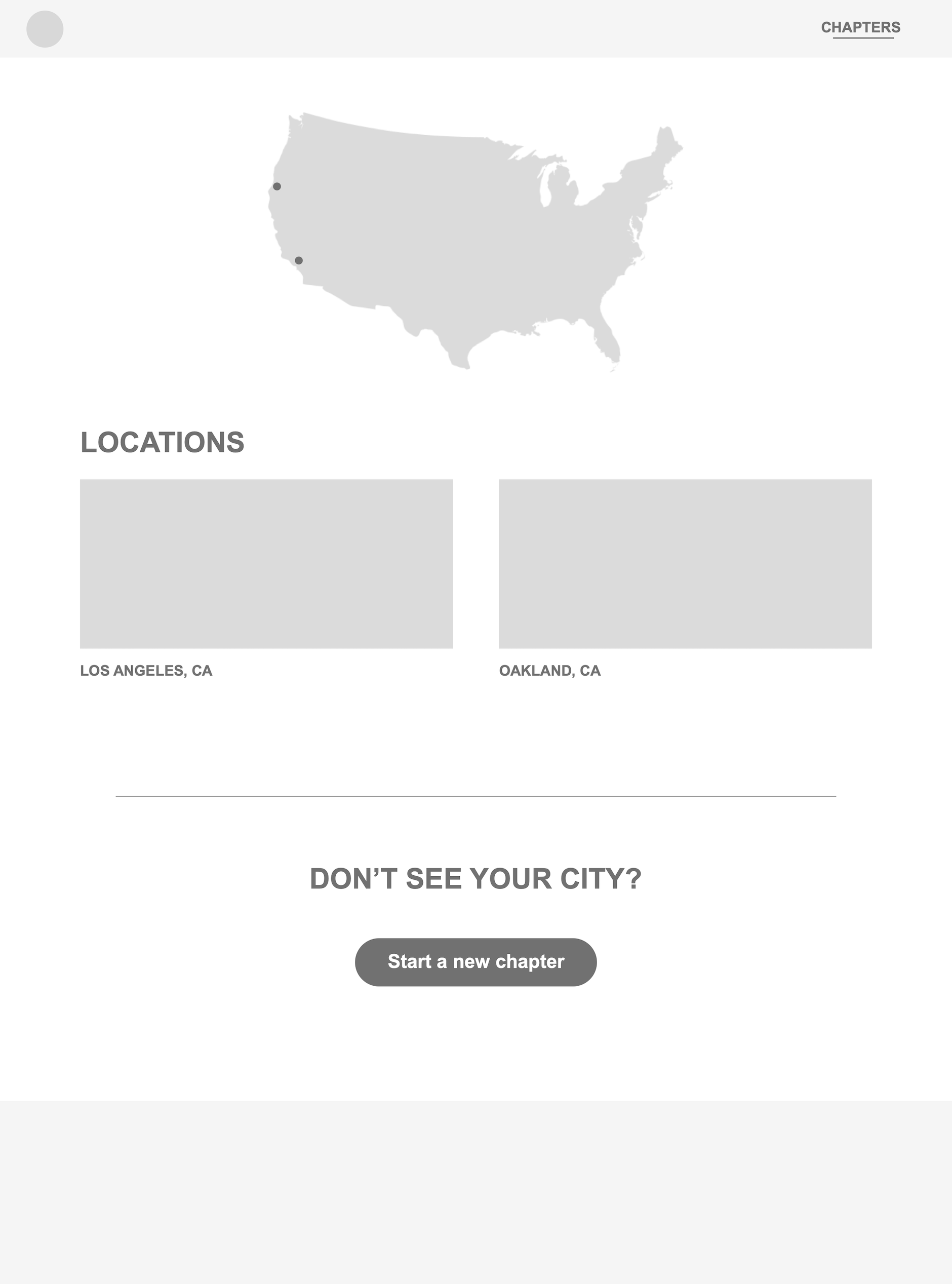
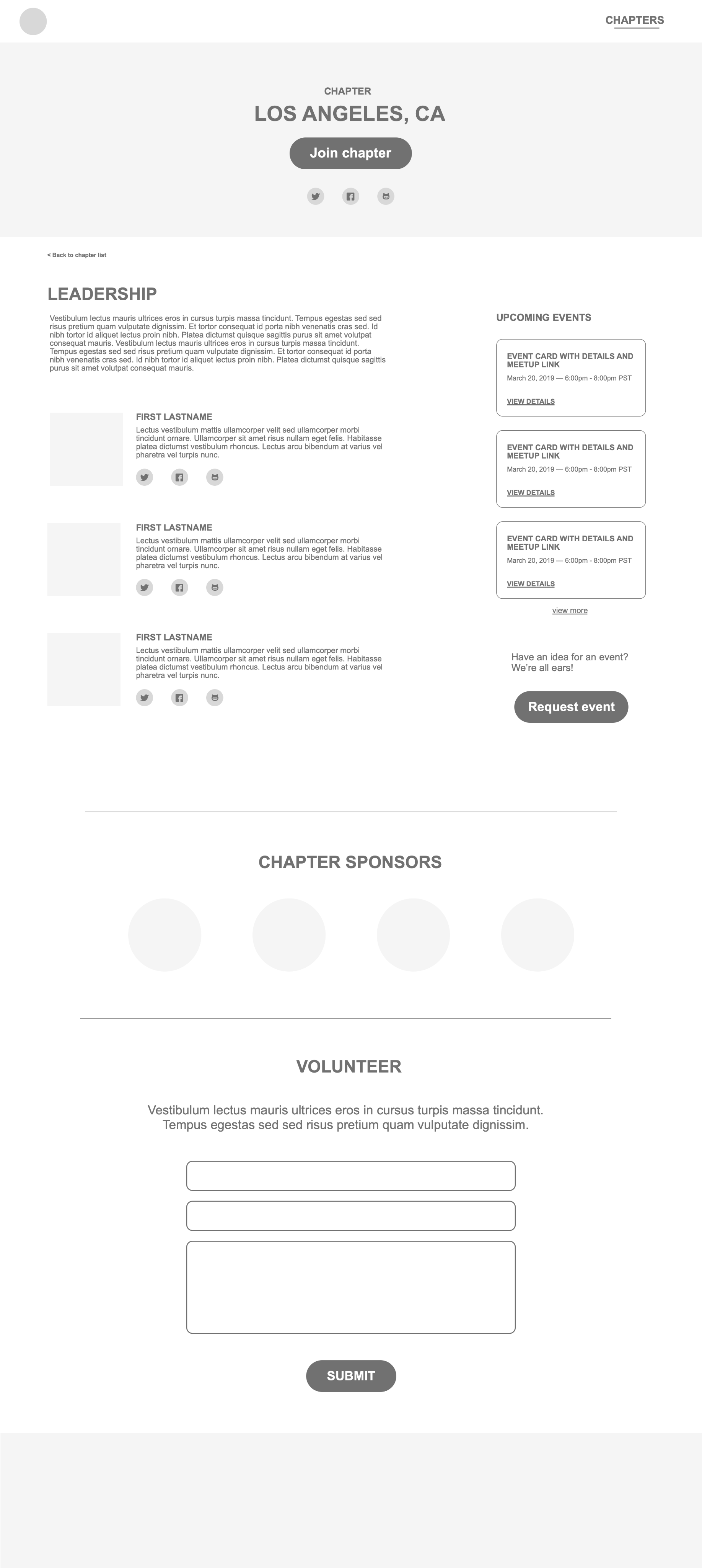
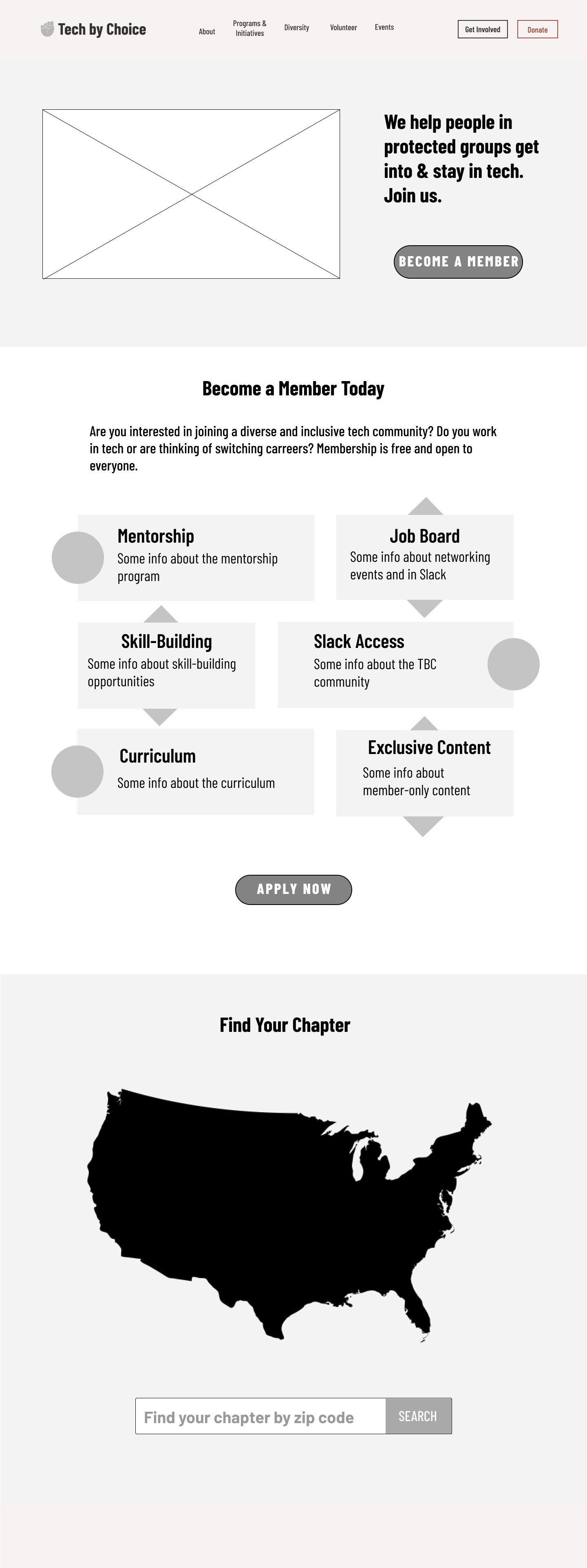
Wireframing for the new website and future member portal
For this part of the redesign project I was part of a team of 3 designers. I focused on wireframing for the future member portal and sections of the current website, while the other designers focused on visual design and the remainder of the website pages.
